Luxury Website Design: 7 Examples B2B Can Learn From
l
Webdesign
Webentwicklung
Branding
Animation
.webp)
Luxury brands sell a feeling
Luxury brands rarely lead with the product. They build a mood and let the offer speak once the stage is set. A recent piece on the Webflow Blog gathers seven high-end sites that do exactly this.
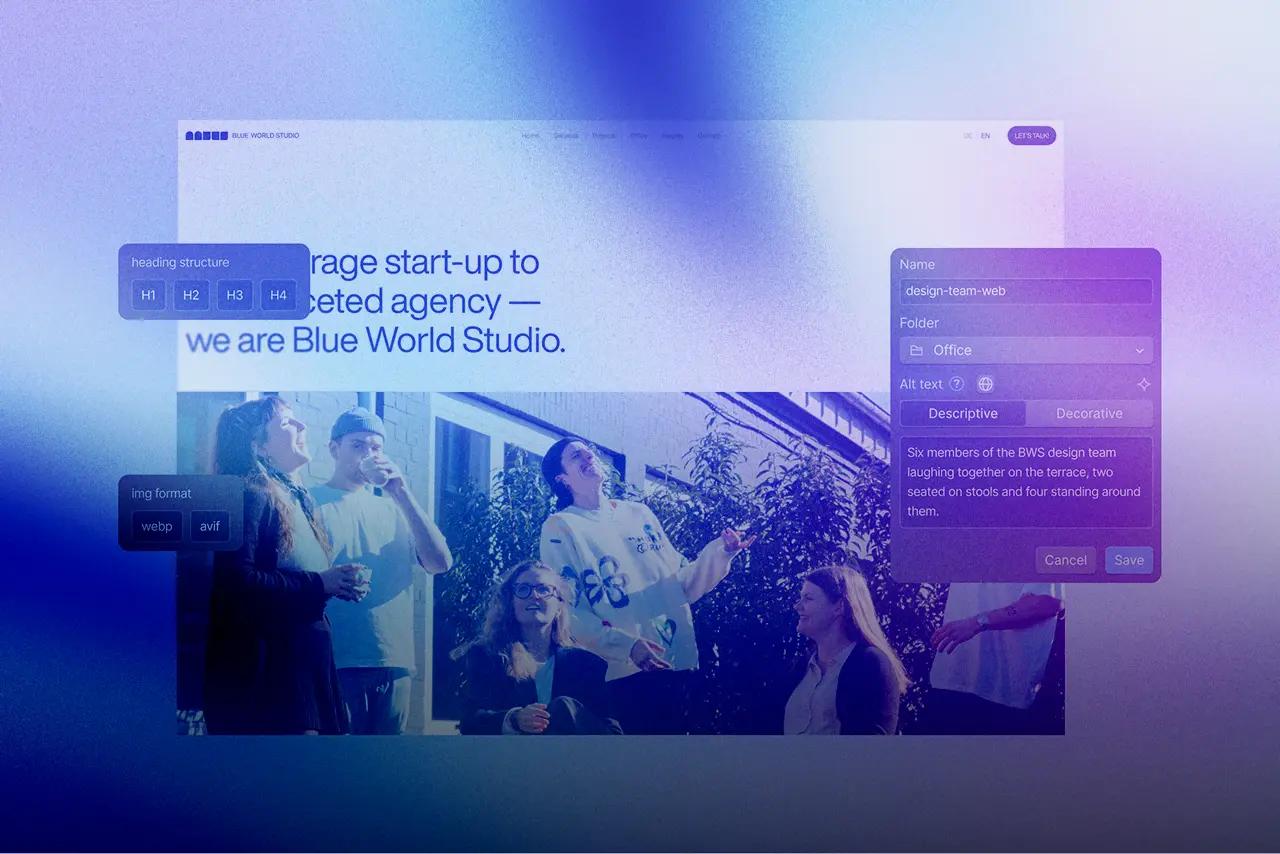
We looked through them and pulled out the patterns that carry over to luxury website design in a B2B context. Because people decide here too, and they buy trust and quality, rarely features alone.
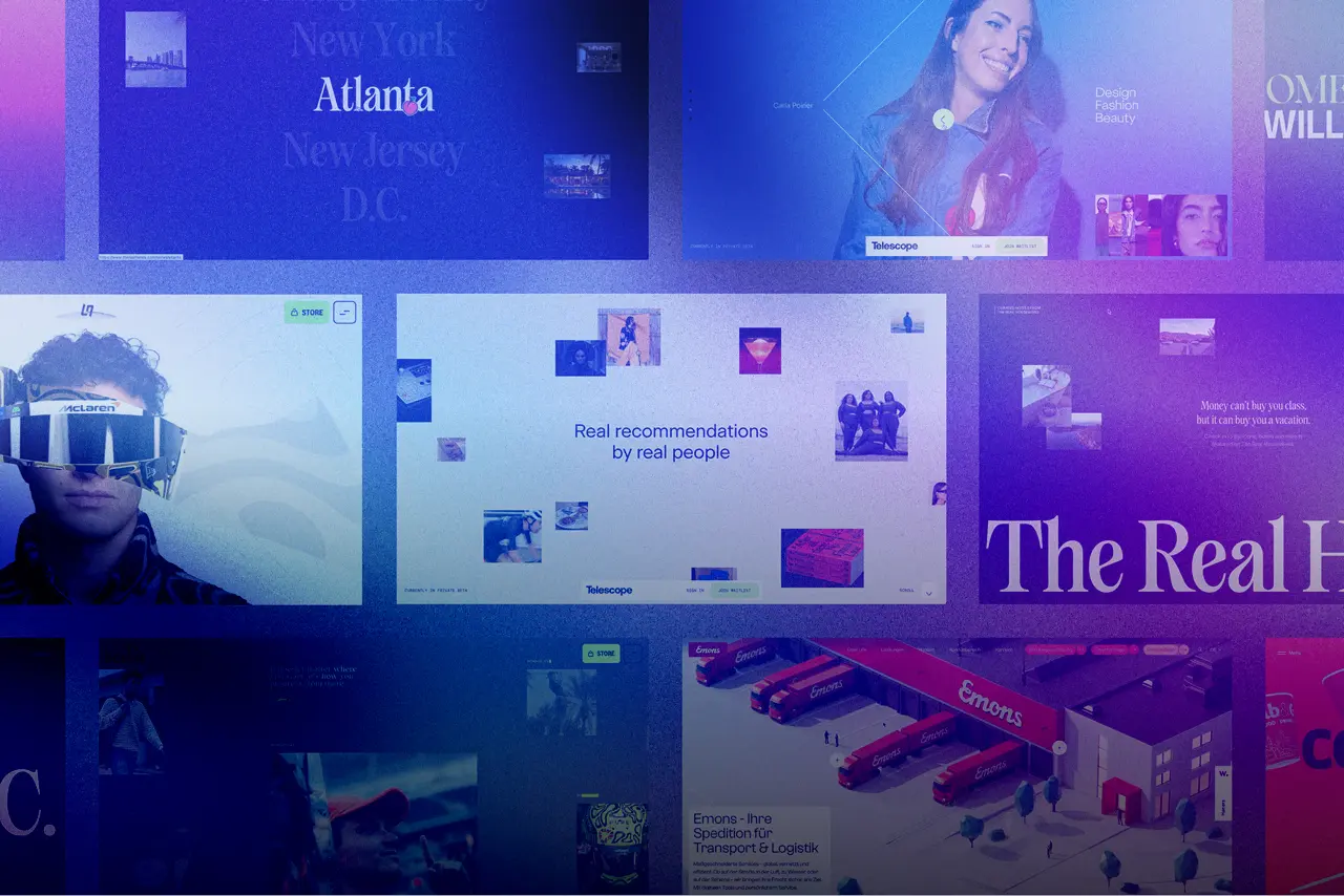
Restraint beats overload: WHITE PLAN, Palmer and Ascension
Strong sites start with a clear visual direction. Fashion label WHITE PLAN leans on generous whitespace and a few targeted effects so the products stay in focus. Calm color, confident type and bold imagery set the tone before a word is read. Sparse animation, subtle hover states and a light glass effect give the site an editorial feel.
Palmer turns its catalogue into a staged moment. Visitors switch into an "experience view" where each piece gently scales up on hover. Microinteractions like these feed straight into the brand experience.
The lighting in each product photo matches the shadow in the layout exactly. That attention to detail lets the quality speak for itself, with almost no marketing copy.
First impressions matter too. The Ascension Luxury Catamaran site uses a dark layout and a striking hero image that reads like the opening of a photo book. Color, layout and type align before anyone scrolls.
For B2B, the first lesson is clear. A stage that highlights a few elements on purpose feels more premium than a page trying to show everything at once. Restraint here is not a sacrifice, it is a choice for focus.
Trust grows through consistency and story: Studio Few and Stewart & Partners
Trust builds on coherence. Design agency Studio Few uses its own site as proof of work and holds every element in one design language. Small type, minimal copy and a near black-and-white palette keep the eye on the visuals.
Architecture brand Stewart & Partners shows how a few precise visuals outperform a crowded gallery. The navigation stays tucked away until you reach for it, and the project shots zoom into unusual details instead of standard mockups.
In luxury, storytelling is part of the buying process. A storytelling website like RAMONA BIZBAC puts the designer and her signature style center stage with parallax motion. Cue pairs a cream-and-red palette with clean visuals and bets on product quality over loud promises.
Combine brand storytelling, design consistency and social proof, and quality becomes something people feel rather than a claim.
What B2B takes from this
The question shifts from what to how. A B2B site convinces less through content alone and more through how it makes that content felt. Storytelling, calm imagery and restrained interactions are the practical tools.
The effort pays off because B2B decisions are slow and expensive. A site with a considered brand experience lowers the perceived risk. If you want to lift your own design to this level, study the brands above.
Sources: Webflow Blog, webflow.com
Conclusion
The seven examples prove that a feeling sells harder than a list of services. For B2B teams, that is a concrete invitation to take restraint, storytelling and a coherent brand experience seriously. Make trust something people can feel, and you stand out in a field where most sites still sound the same.